Teaching Data Science to High Schoolers
April 5, 2018 by Michael Chow
Over the past year I’ve worked on the tools to execute and grade code behind the scenes at DataCamp. This work has ranged from expanding our open source tools for grading R and Python code, to running SQL and bash exercises. However, while helping scale up education data science education to thousands of students is something I’ve wanted to do since helping teach statistics in grad school, there’s is a certain sanity in being in a room with handful of students.
Recently, I had the chance to teach two short workshops, both with an emphasis on data science:
- Intro to Python (Princeton Public Library)
- Intro to R (Coded by Kids in Philadelphia)
In both cases I wanted to follow the same general approach for content:
- Start with a deeply satisfying example, including plots. Let students drive example by changing a few strings.
- Work backward from the example, breaking it into several teachable skills.
- Over the workshop, follow the pattern of teaching a skill, then do a quick assignment.
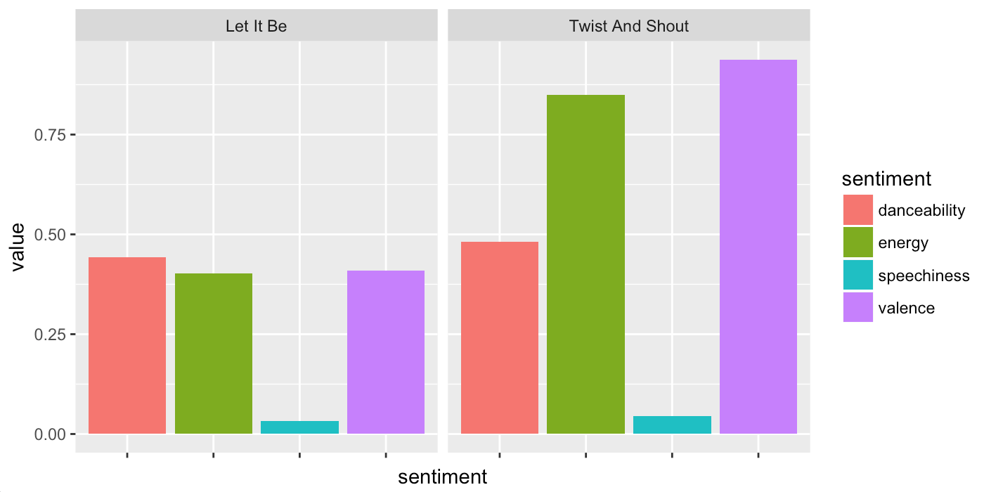
For both cases, the initial example students saw used the Spotify API. This API lets you find your favorite artists, and plot different characteristics of their songs. Characteristics include a song’s “danceability”, “energy”, “speechiness”, and “valence” 1. For example the plot below shows these characteristics for two famous Beatles ditties.
Sorry, Python #
In general, running the Python workshop was much more challenging, in that it required teaching things like functions, lists, dictionaries, and pandas DataFrames. On the one hand, putting up a jupyterhub server let people get started right away. On the other hand, I was at a total loss on how to explain to people across a range of technical backgrounds how to do something as simple as open a jupyter notebook on their computer. 2
By contrast, using R was a delight. By using the Rstudio Server, and a little bit of dplyr and ggplot, students were up and running right away. Inspired by the simplicity of Dave Robinson’s recent Introduction to the Tidyverse course, and convenience of the charlie86/spotifyr returning data frames from the spotify API, I was able to leave out all mentions of functions, loops, and all that jazz 3. We got right into the data.
In a future post I’d like to think about how to make a Python workshop work, but for the rest of this post I’ll focus on R.
Workshop Flow: The ends justify the means #
Every section used an example script, and then a worksheet.
For example, the first 3 “chunks” planned were..
- Day 1-1: explore end product
- Day 1-2: Basic dplyr verbs (filter, select, arrange) 4
- Day 2-1: Basic ggplot
I Won’t go into detail on how to teach dplyr verbs and ggplot, since you can see them on the tidyverse course. Instead, I’ll focus on the big example we used to work backwards.
Exploring the end product #
Once students logged in to Rstudio Server5, I had them open an example script that looked up an artist, and then let them do three things:
- Run code to view the data in a “spreadsheet”.
- Run code to make a scatterplot of valence vs energy for an artist’s album.
- Run code to make a barchart of 4 different characteristics for some songs.
In each of these steps they could modify a string to change the selected artist, album, or characteristics. One goal of this script was to make the pieces that could be modified so clear they didn’t require programming knowledge to change.
1) View data as “spreadsheet” #
artist <- get_artist_audio_features("The Beatles")

# view data -------------------------------------------------------------------
# drop some uneccessary columns, and sort by popularity (higher is more popular)
artist %>%
  select(-album_uri, -album_img, -track_uri, -track_preview_url) %>%
  arrange(track_popularity) %>%
  View()
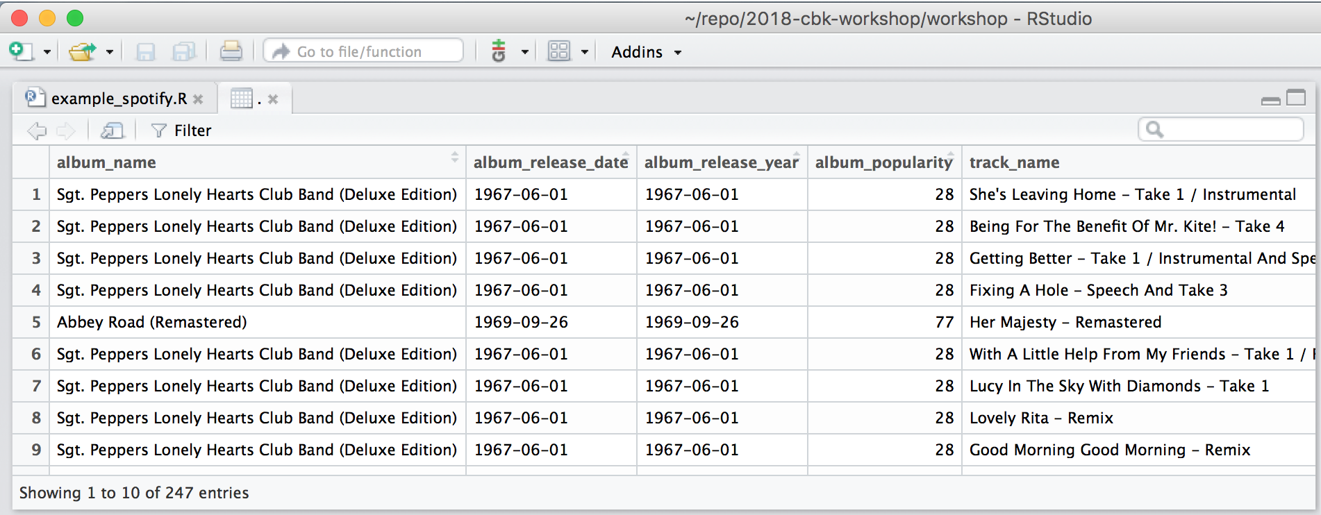
In this case, students were shown how to run code, and instructed to run these lines (using their line numbers).
I like that they can quickly sort songs by popularity and use the search bar in the view pane to find songs and albums. Also, it has a convenient option to filter using any of the columns. While they leafed around the data, we discussed which columns they thought looked like song characteristics6.
After going through the rest of the examples below, I had them try changing “The Beatles” to their favorite band. (and learned that for some students choosing a favorite is a harrowing decision).
Concepts:
- select, arrange, View
- strings (not explained in detail)
- variables (not explained in detail)
2) Scatterplot of energy vs valence #
# energy vs valence -----------------------------------------------------------
# get only 1 album, store result as "album"
album <- artist %>%
  filter(album_name == "Abbey Road (Remastered)") %>%
  select(album_name, track_name, energy, valence, track_popularity)

# make a scatterplot of energy vs valence
ggplot(album) +
  geom_point(aes(x = energy, y = valence)) +
  geom_text(aes(x = energy, y = valence, label = track_name),
            hjust = 'left', size = 2, nudge_x = .01)
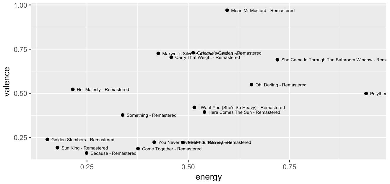
In this case, students saw a scatterplot of energy vs valence for a single album. When we went through it the first time, I briefly mentioned that the filter function was cutting out rows of the data, just like they had done when filtering in the View pane.
After they had selected their own favorite artist in the previous example, I had them find an album via the View pane, and write it in to the filter statement above7.
New Concepts:
- filter
- ggplot, geom_point, geom_text
3) Barchart of 4 characteristics for some songs #
# view other song features ----------------------------------------------------
library(tidyr)
top6 <- artist %>%
  arrange(desc(track_popularity)) %>%
  top_n(6) %>%
  select(track_name, danceability, energy, speechiness, valence) %>%
  gather(sentiment, value, -track_name)

ggplot(top6) +
  geom_col(aes(sentiment, value, fill = sentiment)) +
  facet_wrap(~track_name) + theme(axis.text.x = element_blank())
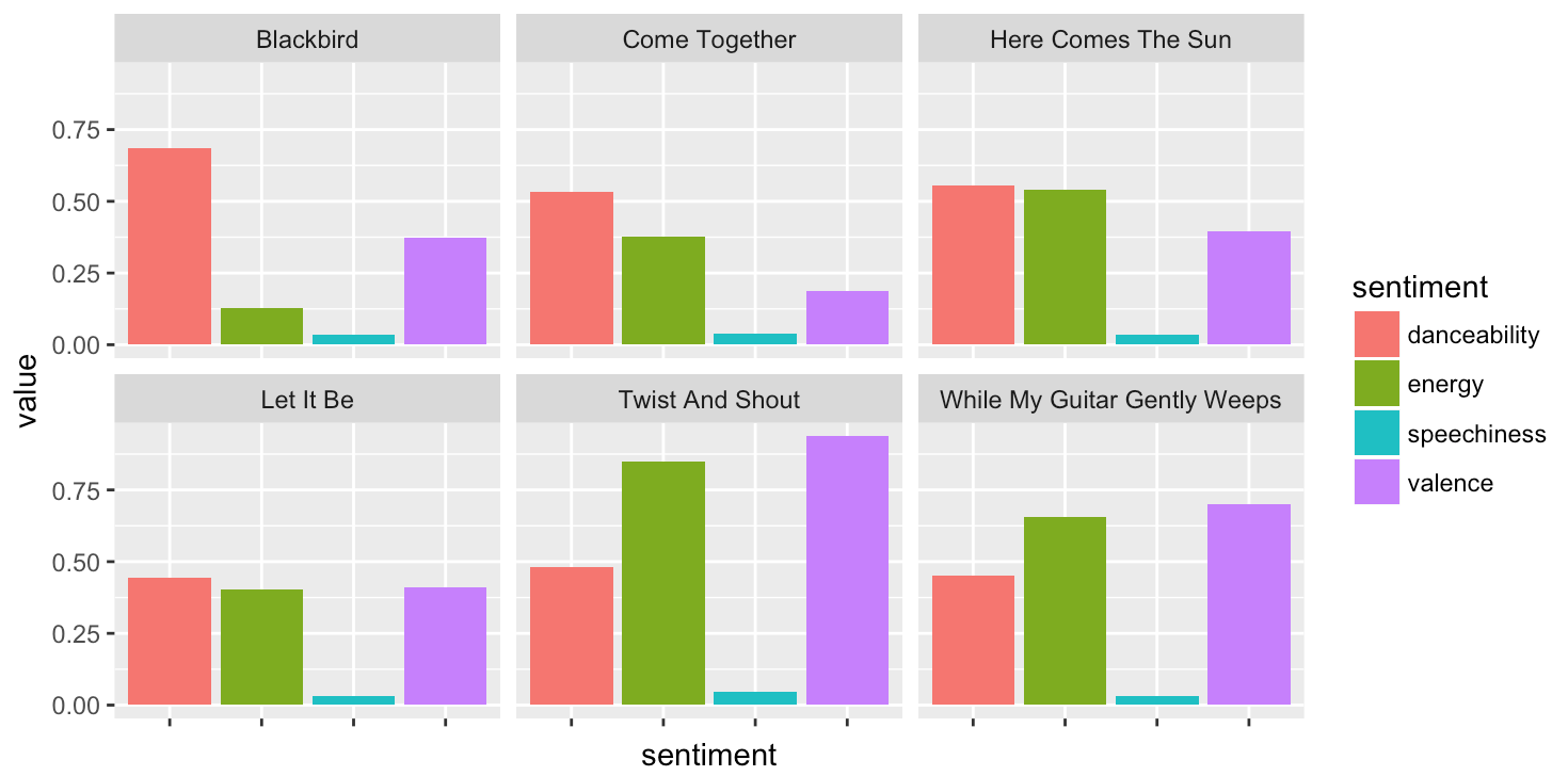
Right off the bat, let me just note two things
- I originally didn’t want to do reshaping, but felt compelled by the plot. Whether this decision was right or wrong, being brought to these decisions is the true value of backward design. In the end I decided to put it in, but not cover how to reshape in detail.
- I screwed up and meant to select the 6 most popular songs, but used
top_nwrong8.
When modifying the script to explore their favorite band, I had them try changing the characteristics selected (e.g. adding acousticness to the plot).
New Concepts:
- basic idea behind reshaping (i.e. data can be reshaped)
- facetting
- geom_col
Take Homes #
What worked #
- To modify the example, students just need to make basic changes.
- As they go through the workshop, they can manipulate more parts of the example.
- Students see through examples right away what data science can do for them.
Gotchas #
- Explaining the phrase “Run Code”
- Explaining the phrase “Pipe x into…”
- Still trying to figure out the best way to introduce ggplot
Next Steps #
Seeing students engage with data right off really shook me up! Based on some feedback from the workshop, I’m really interested to try creating compelling examples using game data, sports data (e.g. www.sportsdatabase.com), and whatever else students might find compelling.
My plan is to clean up the repo used, and to maintain the examples there.
If you’re interested in tackling the challenge of getting students into the world of data,
definitely get in touch.
-
valence is roughly how happy or sad something is, where something more valent is more happy. For a less rough definition, see wikipedia ↩︎
-
If you think I’ve gone crazy, check out the instructions in the jupyter notebook beginner guide. ↩︎
-
A big thanks to my coworker Chester Ismay for suggesting this course as a good outline for the workshop. ↩︎
-
I also tried to teach mutate here, and it was probably overkill. ↩︎
-
Materials and Rstudio setup are on this github repo. I put them up fairly quick, but am happy to clarify things if you open an issue! ↩︎
-
I’m a big fan of adjectivizing words by putting -ness all over my everyday speech, so I felt pretty in my element discussing acousticness, instrumentalness, speechiness, etc.. ↩︎
-
One challenge was that the string had to match exactly, or it would filter out all the data. ↩︎
-
This function takes an extra argument, which a variable which decides the order of the data frame. So the tracks they saw weren’t necessarily the most popular! :/. The plot shown is corrected to show the most popular by spotify’s track_popularity rating. ↩︎